I’ve spent the last few days working on a visualizer for reddit comments. Using reddit’s API, the program downloads a user’s comments and graphs them with flot.
The most obvious way to graph a set of data points is with a scatter plot. Since reddit’s user page only displays 20 comments at a time, it is very difficult to get a sense about how time has been spent on the site. On this scatter plot, every one of my comments is represented by a small circle plotted so its length position along the y-axis represents its number of (non-quotation) characters. Mousing over a circle displays the comment it represents on the right panel. I can see that I’ve spent most of my time talking about League of Legends, that I commented a lot in last July, and that I’m posting less frequently now.
Unfortunately, while it is easy to see that most of my comments are not very long, it isn’t very clear exactly how many shorter comments there are since the points cluster together closely at the bottom of the graph. Adding a heat map or fisheye zoom to the scatter plot could fix this problem, but neither are implemented in flot. Instead, I use a totally different graph type to display the data:
flot also does not include histograms, but sorting and grouping the comments then displaying them with the stacking plugin is simpler than creating a fisheye zoom effect within flot. By removing the time component of the graph, the distribution of comment length becomes much easier to see – the vast majority of comments I’ve made are quite short, even more so than the scatter plot shows.
Still, while the distribution of comment’s length is apparent in the histogram, the distribution of comment length in each subreddit is difficult to discern. Like with the scatter plot, it is clear that the most commonly element – this time the League of Legends subreddit instead of short posts – occurs quite often and others less frequently, but the actual ratio between them is not clear.
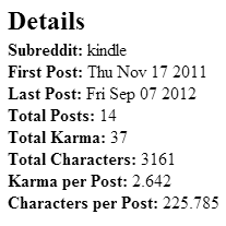
Pie charts generally don’t get a lot of love, but I use one to display total karma (and total comment length, and number of comments) by subreddit because it does a decent job of displaying the ratios and is simpler, more immediately understandable graph than the others. The second point is particularly important with the pie chart because mousing over a wedge shows a quantitative breakdown of the comments on a particular subreddit:
 The mouse over detail for all the other, more complicated charts is mostly composed of the text of the comment which is easier to process than sums and averages. The simpler display of the pie graph allows for comparatively more complicated details.
While removing time from the graph allows for a closer examination of different properties of commenting patterns, it also (obviously) masks how those patterns change over time. One of my initial motivations in undertaking this project was to see if my own habits on Reddit have changed over time, particularly how my commenting on the League of Legends subreddit had changed after I had stopped playing. For that, a sort of pie chart on a timeline graph was needed, like the histograph from Civilization 3:
When I tried to find a histograph plugin for though, I ran into a problem:
![]() Apparently, by ‘histograph’ Firaxis meant ‘history graph’, not ‘histograph, a term of art describing a type of graph’ like I have been assuming they meant for the last 11 years. I’ve tried finding the actual name for this type of graph, but so haven’t been able to unearth one. Undeterred, I implemented a histograph in flot:
Apparently, by ‘histograph’ Firaxis meant ‘history graph’, not ‘histograph, a term of art describing a type of graph’ like I have been assuming they meant for the last 11 years. I’ve tried finding the actual name for this type of graph, but so haven’t been able to unearth one. Undeterred, I implemented a histograph in flot:
This graph shows, in a way none of the others would be able to clearly, how rrenaud initially spent most of his time commenting on r/programming but then transitioned to r/gaming, r/MachineLearning, and r/dominion. (Since reddit shows everyone’s comments to everyone else, this app can be used to view other user’s comment history. Doing so seems a little stalkerish. At the same time, the scatter plot view provides the best, quickest overview of a reddit profile that I’ve ever seen. By mousing over outliers and fiddling with the plot settings, it is possible to see someone else’s most and least popular comments, the posts that they’ve spent the most time writing and what they wrote when they first started using reddit in seconds. If rrenaud ever comes across this post, hopefully he isn’t too weirded out – the graphs on his excellent Race to the Galaxy stats page inspired some of my work here and his site preservers my mediocre rating at the game (In my defense, I lost 10 of my last 11 games; there is probably some sort of connection between the win/loss record and my decision to stop playing))
While the graph is valuable, it need more work. By showing the accumulated number of comments at each time interval instead of the rate of commenting, the start of the graph is extremely sensitive to small changes in commenting patterns while the end doesn’t move near enough. rrenurd essentially doesn’t comment in r/programming anymore but since the graph shows a stock instead of a flow, the graph doesn’t clearly show that information. I’d like a graph of the commenting rate instead, but I’m having trouble creating one which both displays the flow of comments in different subreddits and easily communicates its meaning. Even the current form of the histograph struggles on the communication front – the title of the graph and scale of the y axis need to be changed to better convey the concept of proportions changing over time.
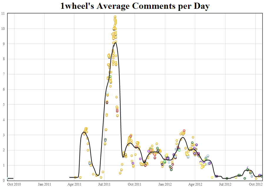
I’ve come a little closer to these goals graphing something similar:
This graph needs less explanation because “Comments per Day” is an easier idea to communicate than what the histograph is trying to show even though both are reconstructing a flow from discrete points.
I’d still like to improve this graph. In particular, the smoothing algorithm needs more work. Ideally, the leftmost part of the smoother would not have a large gap. I’ve tried different kernel smoothers and radii but haven’t found anything that is responsive enough to small change in the data without leaving gaps.
Other things to improve:
Even considering the above reservations, I’m pretty happy about the current state of this app so I’m going to post it to reddit to get some feedback. I’ve also been pleasantly surprised about how long this took me to make – 40 hours of not especially difficult work over a week is still a longish amount of time but it’s significantly less than I would have spent a few months ago.