Adam Pearce


This is a remake of a map John Nelson made over the summer:

Seeing Nelson’s map for the first time, I was struck at how well its combination of two intuitive ideas – transforming starting/ending locations into direction and displaying those directions with a polar histogram – created an instantly understandable visualization. It does a wonderful job of clearly communicating an idea to a wide audience. Sharing what I’ve learned from looking at this map with a sentence: “Most tornadoes in the US travel Northeast and typically occur in the East” isn’t nearly as impactful (a week after hearing that I probably wouldn’t remember the direction) or informative (what do ‘most’ and ‘typically’ mean?) as looking at the map.
I’ve tried to emulate the aesthetic of Nelson’s map while attaching one more simple idea – crossfilter - to it. Some things I’m happy with:
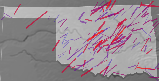 d3′s built in zoom is nice, but it is tricky to use on devices without a scroll wheel. Putting an onclick zoom event on each state avoids this difficulty and has the huge add bonus of playing very nicely with crossfilter. The state to state transitions are my favorite part of this map. Getting multistate tornadoes to behave correctly took a little bit of data wrangling and tinkering with crossfilter; I really like the result.
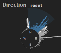 Not the most useful or impressive thing in the world, but I don’t think anyone has done this before in d3 and after another struggle with trigonometry, I’m trilled that it actually works. I’d like to make it more accessible - it might work well in dc.js - but the code needs a lot of polishing first.
Some ‘Todos’ without a checkmark:
 eh… Probably too many charts on the page already.
But! I haven’t posted anything for four months and I’m looking forward to starting something new and applying some of what I’ve learned working full time with d3 over the the last two months.